We all know the out-of-home (OOH) sector is growing with revenue predicated to hit $1 billion by the end of this year.
It’s one of the oldest forms of advertising, dating back to ancient Egyptian times when the laws of the land were inscribed into stones for all to see.
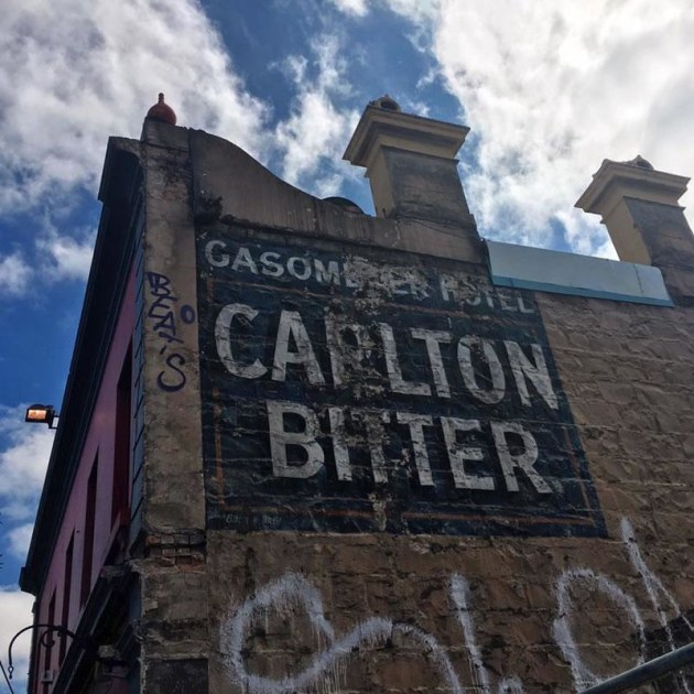
In the mid to late 19th century billboards used to be hand painted, simple with powerful branding, they made an impact on the landscape. Some of these signs still exist today.
Ghost signs as they are more commonly known, are adverts painted onto to brick walls,which today are being preserved by conservators rather than being obscured by fixed billboards.
With the progression of time, has come the progression of technology. When lithography was invented it enabled billboards to be produced on mass which changed the OOH landscape.
We’ve seen another huge change in the past seven years or so in Australia with the rapid rise of the digital panel across many environments across the OOH landscape.
Having worked in OOH for over 12 years, and currently working at Posterscope, I’ve seen some fantastic outdoor creative across the years but on the whole, there is a huge opportunity for advertisers to create something that will remain in people’s memories for years to come.
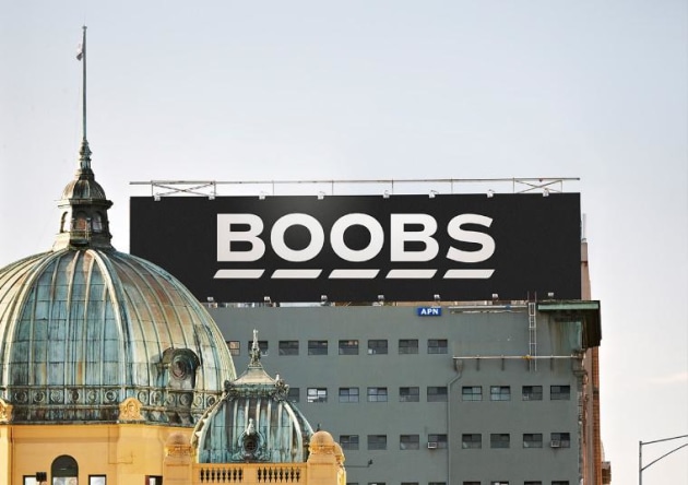
Remember the Bonds ad from 2014? Just a simple two letter substitution made the campaign famous, earning the brand over $4m additonal media coverage.
Coca Cola is possibly the most iconic advertiser in the world with its orgins in OOH stemming from 1925. One of the most most famous campaigns that sticks in my mind is ‘Share a Coke’.
Born here in Australia in 2011, the simple effective messaging that ran on multiple OOH formats was so effective that over the summer of 2012 Coke sold more than 250 million named bottles and cans in a nation of 23 million people.
There are of course, multiple factors involved in ensuring the success of an OOH campaign and often the importance of the role of creative is underestimated.
Ultimately, simplicity is the key to an effective OOH advert. In a world where we are bombarded with messaging, simple copy allows consumers to register and remember.
Furthermore, colour and contrast, clear branding/logo and minimal wording is vital. Studies show that the eye is first drawn to imagery, so encapsualting a brand within or as close as possible to an image will ensure stronger attention. When viewing a landscape panel people tend to read left to right and on a portrait panel top to bottom.
Often, logos tend to be too small and placed at the bottom of the creative so if the brand is not incorporated into the imagery the logo is often the last thing seen.
While there are some great pieces of copy that are cleverly thought out when it comes to placement, this is one area that can really make a difference to the memorability of a campaign.
Will the creative will be running on a panel where people will be driving past it at 40 -60kms/ph? On average people have less than three seconds to read an entire roadside message whilst driving.
Will it be in a high dwell time environment like a café or office lobby where longer copy can be used?
With the rise of digital OOH it’s only made this medium more complicated from a creative perspective.
Advertisers now need to consider not only getting the creative right for the format and viewability, but also the time of day the communication is being seen.
Research tells us that an OOH advert is over 50% more effective for message recall if it’s delivered at the right time, in the right place to the right audience.
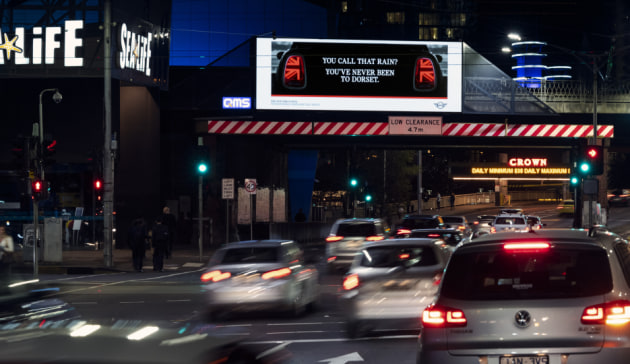
A great example of a campaign that suceeded in adapting traditional creative to run alongside digital with consideration taken on how it would be viewed was Mini.
The traditional creative was simple to read, it had good colour and contrast and messaging was placed near relevant landmarks for further contextual relevance.
The digital creative followed a similar vein but had the additonal thought around the fact the sites could deliver multiple pieces of creative dependant on various triggers such as weather, traffic conditions and time of day.
We’ve seen an uptake of advertisers wanting to do something different and hand painted advertisements have hit the headlines over recent months harking back to earlier days with the uptake of wall mural adverts across the country.
Perhaps this is a sign to advertisers, that it takes time to think about how your OOH advert should look, where will it be placed and how will it be viewed to ensure you are getting the most from your OOH campaign.


