This first appeared in the monthy AdNews magazine. See what's inside here and support AdNews by subscribing here.
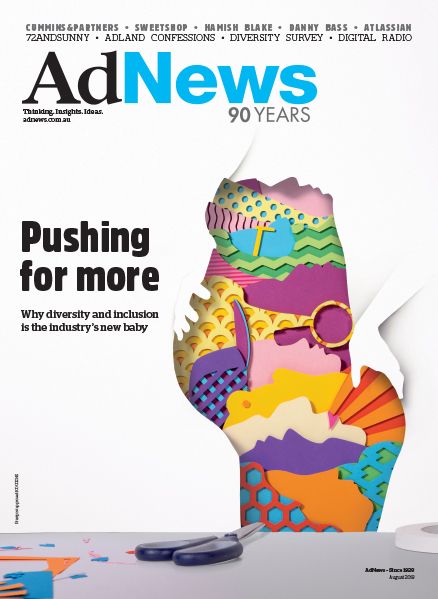
The creative contingent of adland is at the beating heart of the industry. To fully embrace this, and with a mission to create awesome and inspiring covers, each month AdNews hand–picks an agency to work its magic. The cover of the year is then voted for by readers.
To reflect this issue's investigative feature on diversity, we called on 72andSunny to take on the challenge. Editor Pippa Chambers spoke with the agency's senior designer Thanh Lu.
What were your initial thoughts on being asked to do the front cover of AdNews and reaction to the brief at hand?
We were excited to design a cover championing diversity and inclusivity [diversivity!] because that’s what we believe in and have as our mission — to bring more people into the creative industry. However, it did get tricky when we had to pick just one way to bring it to life for the cover.
Post–first brief chat, what went through your minds and what were the next steps you took as a team?
We looked at what diversity meant to us and how we could most meaningfully represent it. We thought it’d be a great opportunity to create something positive, vibrant and fun, because after all, that’s what you get when you build a team of unique individuals.

August 2018 AdNews
How did you know you'd landed on the best concept?
We knew it was the best because it was the hardest to execute — we used layered and cut–out paper to create all of the patterns and shapes. It was also fun to create something with old school tools … and a bit of Photoshop magic.
Who was largely involved?
An ECD on a shoot in the Kimberley in Western Australia, designers armed with scalpels, and a few enthusiastic interns.
What were the biggest hurdles?
We forgot how long it takes to physically cut cardboard and stick it down. But, it came together (slowly, but surely).
Any challenges?
The biggest challenge was choosing the most impactful way to show such a broad and complex issue, but we really wanted to do so in an optimistic light. We also didn’t know if the concept would work in execution until the day it was due. But, it looks good, hey.
Best bit about the process/any funny stories etc?
No paper cuts!
Check out some behind the scenes pics below...
AdNews is proud to deliver strong, independent and credible news 24-hours a day, almost 365 days a year. And we know our free, online news helps power your career and knowledge. But, can we ask a small favour? To fund our ongoing commitment to delivering the best industry news, that you show your willingness to support us by taking a digital subscription to AdNews magazine? The cost is less than $50 for the entire year, and $4.94 per issue. Support AdNews. Support journalism.
Have something to say on this? Share your views in the comments section below. Or if you have a news story or tip-off, drop us a line at adnews@yaffa.com.au
Sign up to the AdNews newsletter, like us on Facebook or follow us on Twitter for breaking stories and campaigns throughout the day.


