The talent crisis and employee preferences for WFH means workplaces need to utilise office spaces as a tool to connect with staff. In Better Workplaces, AdNews looks at how agencies use office design to entice staff to come in and create a company culture worth staying for.
Independent strategic branding and design agency Hulsbosch has an office with a dual personality. Much like the Australian mullet, this office is business up front and party at the back.
Reception desk.
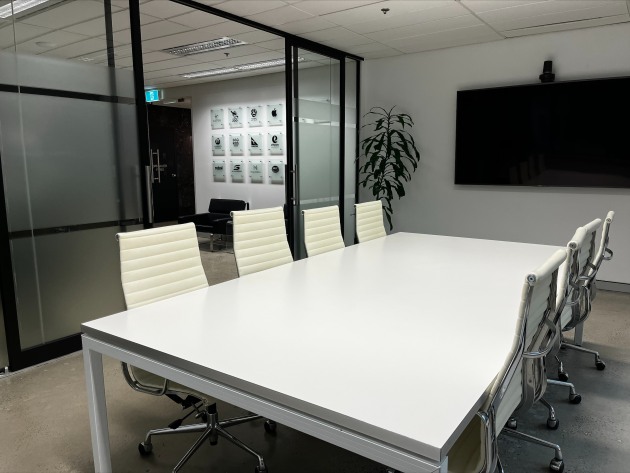
Board room looking into the reception area.
The agency’s semi-connected reception area and boardroom present a corporate classy look-and-feel which matches the company’s branding - simple black and white colour tones, with sleek and stylish furniture.
Agency founder and father Hans Hulsbosch and agency director and son Jaid Hulsbosch in the office reception area.
“The front reflects the Hulsbosch brand and our client’s expectations of us,” Jaid Hulsbosch director at Hulsbosch told AdNews.
“But behind the door, in the creative studio is where the magic happens - it’s a completely different atmosphere. Colourful, creative, excitement!”

Overview of staff desks in the open-planned office.
Past the agency’s corporate entrance the Hulsbosch office is teeming with creative ideas, which to an untrained eye may look messy, but the designers would disagree… it’s all a part of the creative process, an organised chaos.
Having today reached 40 years of operation, whatever the agency’s process, it's surely working.

Hulsbosch specifically painted its walls white so they could utilise them as mood boards. This area is used display past and future work as an inspiration for the creative staff.
Now in the heart of Sydney’s second CBD, North Sydney, Hulsbosch has always found home on the Lower North Shore, as it’s a central location for staff and clients.

Jaid Hulsbosch inside his office, standing in front of his children's artwork. The father and son duo want to keep the creative business in the family, so Jaid actively encourages his children to be artists just like their grandfather.
Hulsbosch: “The entire team had input into designing the office layout 12 years ago when we moved here from Mosman (and Neutral Bay before).
“The end goal for our office layout was always (and still is) about maximising creative collaboration."

Hulsbosch staff using the kitchen island for a brainstorming session.
“Our office configuration is simple - open space, open plan.
“We are fortunate to have a large space where everyone has an assigned desk, so we don’t have to hot desk.
“Desks are grouped into creative, strategy and client management departments, but we all sit together as one team, for functionality and cross workstation communication. Teamwork makes the dreamwork.
“We have a total of twenty-six team members at Hulsbosch, a small but mighty team and have ample desk space for more.
“But the team is not confined to their individual desk or workstation."

Hulsbosch staff quite literally utilise all wall and floor space for their creative process.
“We have collaborative spaces for the team to get together or quiet spaces for them to work alone if desired.
“There are two dedicated spaces where we collaborate as a team and with clients on creative ideas and explore brand and design opportunities.
"These spaces are purpose built for conversation, ideation and inspiration.
“We do our best work when we are together, where everyone’s perspectives, ideas and energy combine."

Hulsbosch staff working with a client on a project. The board is very important for visual aids.
“The spaces are also designed to host clients, to take them on the creative work-in-progress journey and seek out their feedback and input.
“Client collaboration is critical to any brand and design project’s success.”

Hulsbosch in-house photo studio.


Hulsbosch displays awards throughout the office to keep staff inspired.
Steps to sustainability
Hulsbosch: “We are not on just another level in a high-rise building, nor having to share a floor with someone else, or even worse, share office space at the parent company. We have our own place and we value our independence.
“A fully self-contained and private mezzanine level within our A-Grade building."

The private walkway across to Hulsbosch's front door.
"The office is in an A-Grade, 5.0 NABERS Energy Rated building, which includes end-of-trip facilities to support and encourage team exercise and wellbeing.
“We have made significant efforts to ensure we maximise our sustainability program. We no longer have individual rubbish bins.
“We use communal waste, recycle, paper/cardboard, soft plastics, organics and compost bins.
“Plus, we all use keep-cups as the team believes that recycling is the last thing in sustainability – reduce and reuse comes first.”

H art that hangs in founder and executive creative director of Hulsbosch, Hans Hulsbosch.
Have something to say on this? Share your views in the comments section below. Or if you have a news story or tip-off, drop us a line at adnews@yaffa.com.au
Sign up to the AdNews newsletter, like us on Facebook or follow us on Twitter for breaking stories and campaigns throughout the day.


