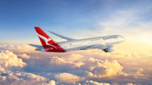
Qantas has refreshed the iconic Kangaroo from its 2007 logo to symbolise the next era the airline is entering.
It has also introduced a new typography along with the silver Kangaroo that replaces the red-and-white image on the tail of Qantas aircrafts. It aims to give Qantas a “more premium feel”, according to Qantas consultant designer Marc Newson.
The brand revamp coincides with of a “game-changing new aircraft, the Boeing 787 Dreamliner, entering the fleet.
"The typography for the word Qantas, which measures almost two metres high on the 787, has been carefully streamlined. And Qantas will appear on the aircraft’s belly, so you can tell when it’s the national carrier flying overhead,” Newson adds.
The rebrand will roll out gradually across the Qantas network from today, beginning with digital assets, signage and advertising completed in 2020 for its centenary.
Speaking to the trade press this afternoon, Qantas group executive brand, marketing and corporate affairs, Olivia Wirth, says that now was the right time for the airline to look at shifting the visual identity of the brand.
“We had a look at how the brand has evolved over the last 95 years and we did think it was fitting [to introduce the new brand identity]. The introduction of the 787 into the fleet is actually the perfect time, not only is it cost effective, but it also speaks to a step change in the experience that the Qantas customer would have on the 787.”
Talking to the subtle nature of the shift in the flying kangaroo logo, Wirth said: “this absolutely is about evolution.
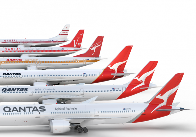
“We wanted to ensure that we're respectful of the heritage of the Qantas brand and to be making subtle changes but also significant change to not only the flying kangaroo but also the typeface. We've introduced the vintage kangaroo and we've made not insignificant changes to the flying roo on the tail,” she added.
Wirth wouldn't be drawn on the cost of the roll out, which will see the whole fleet being badged with the new look, only noting that having a new aircraft in the 787 makes the timing of such a brand refresh more cost effective.
Qantas Group CEO Alan Joyce says: “Since the image of a kangaroo first appeared on a Qantas aircraft more than 80 years ago, it’s come to represent the spirit of Australia. When passengers see the Qantas tail at airports around the world, it’s a symbol of home.
“We wanted to make sure our brand remained familiar but we also wanted it to be more modern and dynamic, like the 787 and like Qantas."
 The evolution of the Qantas logo
“A fresh brand helps symbolise the new era Qantas is entering as we head towards our centenary. It’s an era of new destinations, new technology and a new standard of service,” added Mr Joyce.
It is the fifth change of the image, which was introduced in 1944.
The new design was overseen by Newson, in partnership with Australian design agency Houston Group.
Have something to say on this? Share your views in the comments section below. Or if you have a news story or tip-off, drop us a line at adnews@yaffa.com.au
Sign up to the AdNews newsletter, like us on Facebook or follow us on Twitter for breaking stories and campaigns throughout the day.

